Page 11: Total Domination
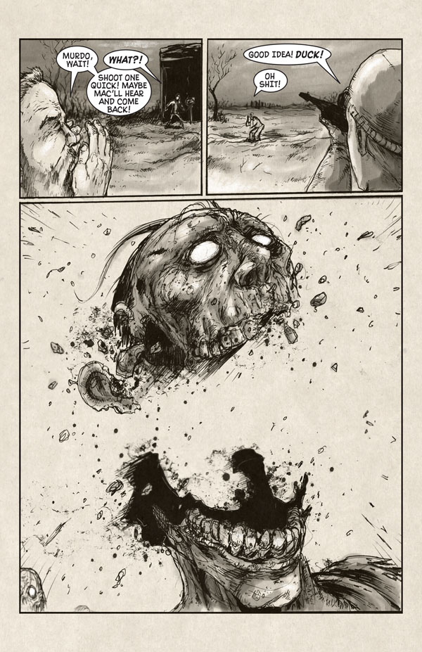
Wednesday, January 17th, 2007This page is awesome. After seeing this piece by artist Owen Gieni I knew I was going to need something similar for Last Blood, and he didn’t disappoint. I especially love the teeth and the ear, but the whole thing is pretty spectacular. If only we could duplicate that on film. We’ll see.
“Total Domination” is something I often say while watching friends of mine win poker tournaments online, describing how they’re dominating the table and winning easily, even if they’re not — I just like saying it. So I thought it would be an appropriate title for this page, as that zombie got completely owned.


January 17th, 2007 at 2:49 am
I love how the lower jaw bones are still intact, and the upper half of the skull is just blown off.
Also, you might be able to achive that effect by either using animation, or by making a model or something, with charges set in certain places.
January 17th, 2007 at 4:20 pm
Although, I doubt that any living person’s head would have fallen in half like that. That’s why zombies are cool. Nobody’s really sure what the level of resistance is.
That zombie in the background looks a little scared. Maybe they’re smarter than they look. Or maybe it’s just looking zombieish. Mysteries.
January 18th, 2007 at 1:40 am
Favourite page so far!
Take that zombie!
BWAHAHAHAHA!
January 18th, 2007 at 1:52 pm
I really love the artists work on all of his sites… even though this is a huge departure from his normal style I am glad to see that he is really doing some quality work. The main problem I forsee is that he is doing too good a job 🙂 when it comes time to shoot the movie your going to have a hard time recreating the effects hes managed here. Its hard to tell someone that they are doing too good a job though…. keep up the great work!
January 19th, 2007 at 1:36 am
Yeah, Owen’s the best. Hopefully we’ll get a decent sized budget on the film and get some cool special effects and makeup work done.
April 5th, 2007 at 4:29 pm
I’m just crossing my fingers and hoping that the special effects budget will be enough to have the camera follow the bullet at full speed until it hits the zombie, when it will switch to slow motion as the head flies apart and then back to full speed as the explosion finishes.
Ideally, at this point the nine inch nails soundtrack will kick in.
May 6th, 2007 at 11:37 am
This is why this comic rocks..oh and the story helps out too!
June 16th, 2007 at 10:48 pm
What comic is that art from? The one by Owen Gieni?
June 16th, 2007 at 10:56 pm
I’m not sure actually, but if you join this site you can probably find out the answer —
http://cecania.com/
June 29th, 2007 at 9:23 pm
love the detail its sweet
September 24th, 2007 at 1:00 pm
BOOM, HEADSHOT! xD
December 2nd, 2007 at 9:41 pm
Love the gore!
I love this artist.
Kudos.
December 10th, 2007 at 1:08 am
I LOVE the chunks of zombie head
December 10th, 2007 at 1:28 pm
THIS IS THE BEST PAGE SO FAR!
July 4th, 2008 at 1:17 am
I love how the lower jaw bones are still intact, and the upper half of the skull is just blown off.
Also, you might be able to achive that effect by either using animation, or by making a model or something, with charges set in certain places.
—————————————————————————-
That’s how they produced the effect for romero. Create a dummy head (reusable) with plates that interconnect making up everything above the jawline. You can mold clay onto the head for features. Then pack the blood packs and misc brain materials into the skull cavity and blow it all up.
July 30th, 2008 at 4:57 am
Awesome art on this one. I Just discovered this comic today, and all I can say is AWESOME! Love the idea, love the art… I’m not gonna get any work done today. 🙂
May 18th, 2009 at 5:25 pm
wow! I love that!! its the coolest art i’ve seen for a while! its like the zombie just shattered and split in one shot! so cool and gruesome (i only say that for really awesome things)